( photo not up)
For portraits i had a picture of my little sister looking up to the left. I thought the photo looked pretty good.I could have had better lighting and maybe added something to the picture to make it a little different than every other portrait out there.
JP Gallardo's Journal
Sunday, June 5, 2011
Portraits
 |
| This caught my eye because this young boy was dressed so brightly as an Indian god. |
 |
| I liked this picture because of the blue background and how the man was wearing all white. |
 |
| I liked this one the most because of the mans eyes and his bright turban which matched the background. |
 |
| I liked this picture because of the mans face and the cross in front of him added something extra to the picture. |
 |
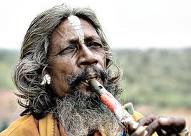
| I liked this picture because of the flute mostly and the mans pepper colored hair. |
 |
| I liked how the light fell over the mans face. |
 |
| I really liked the texture of the face and the bright colors of the clothes. |
 |
| I was drawn to the red and white paint. |
 |
| I liked the reflection on the glasses and how they were a little crooked. |
 |
| I liked the turban along with the mans facial hair. |
What makes a great photograph
Many things can make a great photo personally I like a photo with a story or message behind it. Some other things that I like in great photographs are the lighting and the contrast of colors meaning like one thing that really stands out.
National Geographic-The photographers
- Working in limited lighting.
- Removing distractions.
- Timing. Timing. Timing.
- Focusing on the eyes.
- Being aware of your surroundings.
My favorite photograph was the one of the crying boy whose sheep had been killed. I really liked this picture because of the story behind it.
With the one of the Afghan lady the picture was focused on her eyes which we had talked about.
There was a picture with a person framed with a school of fish so a frame within a frame which we had discussed.
Making my positive and negative
I thought the turn out of my positive negative was good. I wish the negative half would have turned out better though, they were a unclear. I also could have picked a better subject.
Framing my photo
(picture not up)
For framing I took a picture of my sister walking and placed her in between two branches making the frame. I thought the picture was average not really my best picture. I could have framed it better and used a filter so it wouldn't be so grey.
For framing I took a picture of my sister walking and placed her in between two branches making the frame. I thought the picture was average not really my best picture. I could have framed it better and used a filter so it wouldn't be so grey.
Rule of Thirds my photo
(photo not up)
For my Rule of Thirds photo i took a picture of three wine glasses on a glass table with a window in the background. The light was coming in from the window and the wine glasses reflected off the glass table. I liked the photo though it was a little dusty and unfocused. I i could change any thing I would have fixed those problems.
For my Rule of Thirds photo i took a picture of three wine glasses on a glass table with a window in the background. The light was coming in from the window and the wine glasses reflected off the glass table. I liked the photo though it was a little dusty and unfocused. I i could change any thing I would have fixed those problems.
Subscribe to:
Comments (Atom)